I just finished Count Zero, the second book in the Sprawl trilogy by William Gibson that basically invented cyberpunk. Coming after Neuromancer - the defining book of the genre - it couldn't possibly fill those shoes. And he honestly doesn't give a fuck. And that's why I like it. He just powers on through the story, 7-10 years after Neuromancer ends, and does ZERO explanation of anything or anyone. You just have to remember the first book, get the references, and go with the flow when he mentions someone use a "Hodaka deck" and you have no fucking idea whether it is a piece of architecture that you put deck furniture on, or a CD drive, a skateboard, or a cyberspace box of some sort. There is a casual tone to this book. He's writing it for himself, to play with some ideas and suss out some interesting threads he left hanging in the first book. He doesn't care if you get it or not; he's doing this for his own interest and pleasure. So it's fun to ride along with his stream of consciousness and see how he ties all this shit together at the end. Which he doesn't actually do, because, ya know, this is the second book of a trilogy. So now I'm off to read Mona Lisa Overdrive, the final book of the trilogy, and possibly the worst/best scifi cover art ever.
For some reason, Mona Lisa Overdrive suffered a number of terrible covers. The mass-market paperback with the most printings could be a cover for literally anything, which is better than the awful ones like the one you found. The competition for "worst sci fi cover art", by the way, is steep.
Oh man, back when I was reading through the Hugo winner list it was a victory parade of awful covers. There's a particular grossness to the 60s-70s era, but it's hard to say there's a time period where they don't suck. The other day I picked up one which has this exceptionally awful cover: It's bad enough that I had to hide the cover of it when leaving the bookstore, but I also have this terrible non-germane representation of the character corrupting my mental image of what the character was intended to be. Edit: OH almost forgot the worst part: red edge gilding on the book.
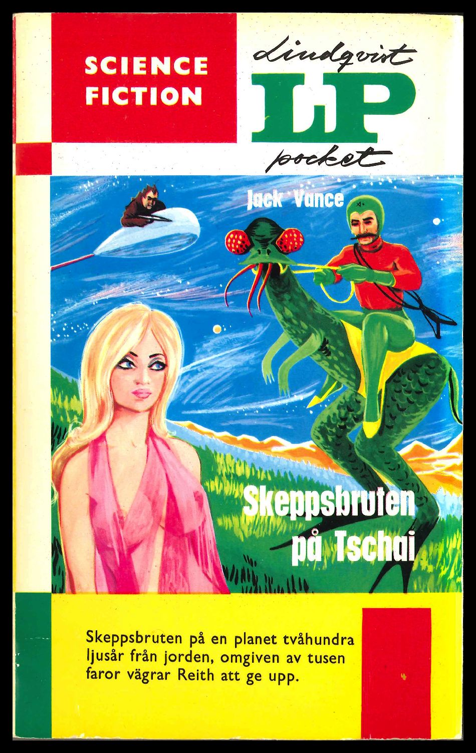
I think it was a problem of cheapness. There were lots of books, there were talented illustrators, but there wasn't enough money for every book to have a talented illustrator. I mean, that's peak Frank Franzetta time. Michael Whelan was rolling in. Vincent de Fate was everywhere. But you also got stuff like this: (also a Jack Vance, first book of Planet of Adventure, which your Jack Vance cover has also been used for:)